
Study · Kresmion Research
Is the 2026 Stock Advance Broad, or Just a Few Names? A Breadth Study
Across the 3,838 stocks Kresmion measured in the three months to June 15, 2026, fewer than half rose and the typical stock ended the window flat at zero.
The 2026 advance was carried by a thin cohort of big winners, not a broad move: the median stock returned 0.0 percent, the equal-weight average was +11.8 percent, and only 46.5 percent of names rose at all.
The question, and why the answer is not obvious
When a market index climbs, the natural reading is that "stocks went up." That is a statement about an average, and an average can mislead. If a handful of companies surge while most others tread water, the index can rise even though the experience of the typical stock is flat. Whether an advance is broad, meaning most names participate, or narrow, meaning a few names do the heavy lifting, is one of the oldest questions in market analysis, because the two situations tend to look very different under the surface.
To answer it for Kresmion's own equity universe, we measured the simple price return of every tracked company between March 16, 2026 and June 15, 2026, a three-month window, and then looked not at a single average but at the whole distribution: how many names rose, where the median sat, where the mean sat, and how far apart those two numbers were.
The headline result is a textbook case of a narrow advance. Of 3,838 stocks with a valid closing price on both anchor dates, 1,786 rose. That is 46.5 percent, meaning a slim majority of the universe was flat or down over the window. The median return, the return of the name sitting exactly in the middle of the ranked list, was 0.0 percent. The equal-weight mean return was +11.8 percent.
Mean versus median: the tell of a skewed market
The single most informative number in this study is the gap between the mean and the median, which came to +11.8 percentage points, a mean of +11.8 percent against a median of 0.0 percent.
In a symmetric, broad-based advance the mean and median sit close together, because gains and losses are spread evenly around the center. When they pull apart, the distribution is skewed. A mean that sits far above the median is the signature of a right-skewed distribution: most of the data clusters low, and a small number of very large positive values drag the average upward. That is exactly what we see here. Only 30.0 percent of names, 1,150 of 3,838, even beat the equal-weight mean, which is the arithmetic fingerprint of a few outliers carrying the average.
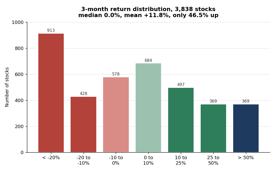
The full distribution makes the shape concrete. Bucketing the 3,838 names by return: 913 fell more than 20 percent, 428 fell 10 to 20 percent, 578 fell 0 to 10 percent, 684 rose 0 to 10 percent, 497 rose 10 to 25 percent, 369 rose 25 to 50 percent, and 369 rose more than 50 percent. The single largest bucket is the worst one. The biggest cluster of names, 913 of them or 23.8 percent of the universe, lost more than a fifth of their value, while a thinner band of extreme winners pulled the average up and away from a flat center. The median's flatness masks a heavy left tail offset by a small group of very large gains.
Where the gain actually came from
If the average is being carried by a few names, the next question is where in the distribution those names sit. The answer is the far right tail. A +11.8 percent mean rests on top of a 0.0 percent median with fewer than half the names up, because a fat right tail does the lifting: 738 names rose more than 25 percent, and of those, 369 rose more than 50 percent. At the same time 913 names fell more than 20 percent and the typical stock did nothing at all.
That combination is the whole story of a narrow move. The gains are concentrated in a minority of large winners, not spread across the tape. A reader who saw only the +11.8 percent average would picture a broad advance in which most stocks rose. The distribution shows the opposite: a flat middle, a heavy left side, and a small cluster of outsized winners that, by themselves, account for the positive average.
Why the two summary numbers disagree
The mean and the median disagree here for a mechanical reason, not a mysterious one. The median counts names: it asks what the middle stock did, and the middle stock did nothing, because more than half the universe was flat or down. The mean sums magnitudes: a stock that rose 200 percent contributes far more to the average than a stock that fell 20 percent can subtract, so a thin set of very large winners can hold the mean well above zero even while most names languish. When those two summaries diverge as sharply as they do over this window, plus 11.8 against 0.0, that divergence is itself the measurement of how concentrated the move was.
What this does and does not mean
A narrow move is a description of the past, not a forecast. Concentration tells you that the recent gain rested on a few shoulders; it does not tell you what happens next, and past patterns need not repeat. Markets have run narrow for long stretches and stayed narrow, and they have also broadened out. Nothing in this study anticipates which path follows.
What the study does establish, reproducibly, is the shape of the move. Over this specific window, participation was weak at 46.5 percent up, the central tendency was flat at a 0.0 percent median, and the average was positive but driven by outliers at a +11.8 percent mean with only 30.0 percent of names beating it. A reader who only saw the positive average would have a materially incomplete picture of what happened to the typical stock.
Key takeaways
| Metric (window: March 16 to June 15, 2026) | Value | What it tells you |
|---|---|---|
| Stocks that rose | 1,786 of 3,838 (46.5%) | Fewer than half of the universe participated |
| Median return | 0.0% | The typical stock went nowhere |
| Equal-weight mean return | +11.8% | Positive, but pulled up by outliers |
| Mean minus median gap | +11.8 percentage points | A right-skewed, concentration-driven move |
| Names beating the mean | 1,150 (30.0%) | Most names lagged the average |
| Names up more than 25% | 738 | The right tail that carries the mean |
| Names up more than 50% | 369 | The most extreme winners inside that tail |
| Names down more than 20% | 913 | The single largest bucket in the distribution |
Methodology and sources
All figures are computed from Kresmion's `company_price_snapshots` table in the production database. The full SQL is saved for reproducibility, and this is Kresmion Research analysis.
Data window. A single three-month window, from March 16, 2026 to June 15, 2026. Both dates are exact trading dates present in the data, so each stock is measured from its closing snapshot on 2026-03-16 to its closing snapshot on 2026-06-15.
Sample and filter. The universe is the 3,838 companies that have a closing snapshot with close greater than zero on both 2026-03-16 and 2026-06-15. Per-stock return is simple price-to-price: the closing price on June 15 minus the closing price on March 16, divided by the closing price on March 16. Breadth, median, mean, and the distribution buckets are computed across all 3,838 names, with no market-cap weighting applied anywhere in this study.
Honest limitations
This study has real weaknesses, and they should temper how far the result is pushed.
First, this is one three-month window. A single window is not representative of a full year, and breadth can swing materially with the start and end dates chosen. Read this as a description of this period, not a structural property of the market.
Second, survivorship bias is present by construction. Only the 3,838 names with a valid closing snapshot on both anchor dates are included. Stocks that were added, delisted, or had a missing snapshot on either date are excluded, which biases the surviving set.
Third, these are price-only returns. There is no dividend, split, or total-return adjustment, so the per-stock figures are price changes rather than full economic returns.
Fourth, and most important for interpreting the mean, this runs on Kresmion's own simulated price feed, which contains extreme values: a minimum return of -100.0 percent and a maximum of +8,536.4 percent over the three months. Those simulated outliers inflate the equal-weight mean, so the gap between the mean and the median is partly an artifact of the feed's tails rather than purely a real-world skew. The breadth count of 46.5 percent up and the median of 0.0 percent are robust to outliers; the +11.8 percent mean is not.
For more on how Kresmion sources and validates its data, see the methodology page. For the daily read on markets, see the Research Notes, and for the full library of studies and explainers, see Learn.
Frequently asked questions
Does "46.5 percent up" mean the market fell?
It means fewer than half of the tracked stocks rose over this specific window, and the typical stock, the median, was flat at 0.0 percent. The equal-weight average was still positive at +11.8 percent, because a thin group of very large winners held the average up even though most names did nothing. Weak participation alongside a positive average is precisely what defines a narrow move, and this study reports both facts side by side rather than choosing one.
Why report the median when everyone quotes the average?
Because the average can hide the experience of the typical stock. When a distribution is skewed, as this one is, the mean is dragged toward the extremes while the median stays at the center. Here the mean was +11.8 percent and the median was 0.0 percent. Reporting both, and the gap between them, is what reveals that the gain was concentrated rather than broad. The median answers "how did the middle stock do," which the average alone cannot.
Is this a prediction that participation will broaden or narrow further?
No. This is a study of what already happened over a fixed past window. It measures the shape of the move; it does not forecast the next one. Past patterns need not repeat, and Kresmion Research is informational only, with no buy, sell, or directional view.
Could the result change with a different window?
Yes, and that is a stated limitation. Participation, the mean, and the spread of the distribution can all shift with the start and end dates. This study fixes the window at March 16 to June 15, 2026 and reports that period only. A different three-month window could show broader or narrower participation.
- · Kresmion production database: company_price_snapshots table (closing snapshots on 2026-03-16 and 2026-06-15)
Kresmion publishes information, not investment advice. See our methodology and the latest research notes.
Kresmion is free during beta. A free account makes your watchlist permanent across devices and adds alerts when new signals fire. No card, about 30 seconds.
Start free